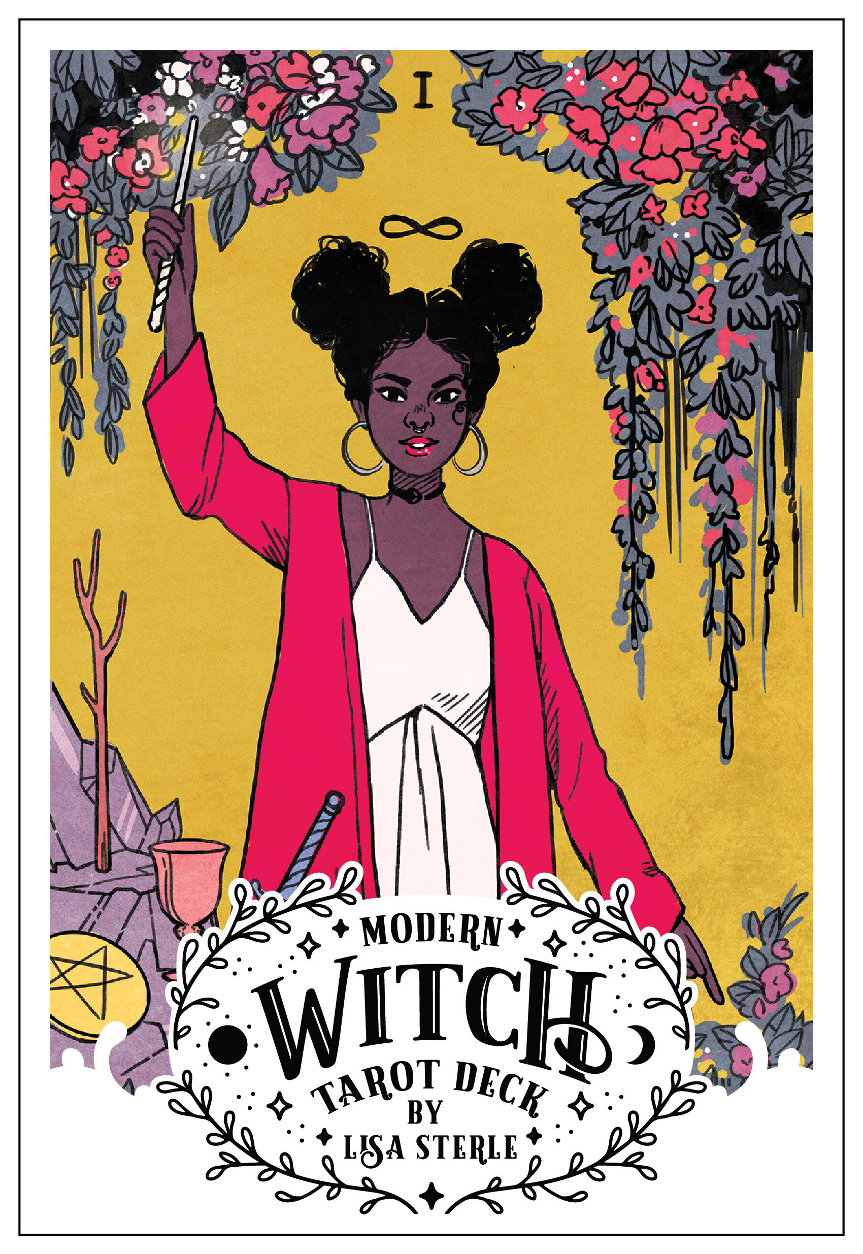
Lisa Sterle is the creator of the Modern Witch Tarot, a new inclusive tarot deck inspired by modern witches. Charlotte Richardson Andrews (The Culture Witch) had a chat with Lisa about her tarot journey and her new inclusive deck.
Cunning Folk Congratulations on creating such a beautiful deck. Is it safe to assume you identity as a modern witch? And if so, could you speak a bit about your practice?
Lisa Sterle Thank you, and yes I’d consider myself a modern witch. As far as my practice goes, I actually mainly only practise tarot at the moment. It was the first thing that got me into witchcraft.
CF How did you first discover the tarot?
LS I think I first ran across tarot in high school, and I’m thinking it was probably through some witchy movie or YA book that I discovered it. I didn’t get my own deck and start reading myself until college; I had a few friends that regularly practiced tarot and looking through their decks was instantly fascinating and inspiring. I totally felt it calling to me right away. My first deck was the Thoth deck.
CF You say in the instruction guide to the Modern Witch Deck (MWD) that you began making this deck during a time of professional and personal (creative) gloom. Could you elaborate?
LS Yes, it’s a bit strange of an origin story. I was working a dead-end graphic design job that was draining away my passion for art and my faith in humanity. I was 100% burnt out and felt totally unappreciated and uninspired; I felt like my art hadn’t really gone anywhere new for a while. I didn’t know what to do. So the Ten of Swords was really calling to me during this really bleak period of my life. And like sort of this divine spark, I had my idea for the first card of the deck. The fact that I was able to transform a really bleak and negative period of my life into something positive is one of the things I really love about this deck and it speaks to my general mission with art.
CF Would you say the MWD helped you to course correct?
LS For sure. This deck was one of the projects that allowed me to go full-time freelance and my art has taken on such a new life creatively ever since. I’m so grateful for it.

CF The instructions feature a foreword by (New York fiction writer) Vita Ayala. How did you cross paths?
LS I first worked with Vita on a creator-owned comic back in 2018 called Submerged. They are a supremely talented writer and we really bonded on a lot of shared interests and similar creative inspirations when working on that comic. I really admire Vita; they are driven, super smart and inspiring as a creator. When it came time to figuring out who would be writing the foreword, I knew they were the perfect choice and they did an absolutely beautiful job. I couldn't be happier.
CF Now to the deck itself: did other tarot artists inspire you? If so, who and why?
LS Pamela Coleman Smith’s art was a big influence. There’s something about her bold, graphic style that has always spoken to me, but it really wasn’t until this deck that I really tried to explore it.
CF Alternative tarot decks have been around a while now, but the first one that really spoke to me as a queer millennial was Cristy C. Road’s Next World Tarot. Are you familiar with this deck?
LS I am not, but I’ll definitely be checking it out. I love getting deck recommendations.
CF I’m guessing you drew on pre-existing scholarship when it came to researching tarot symbols and archetypes. What/who were your go-to tarot books and experts?
LS I had a big stack of different books that I’d reference for each card design as a refresher on the different ways to interpret each deck. The books I went to most often though were Seventy Eight Degrees of Wisdom by Rachel Pollack, and Modern Tarot by Michelle Tea.
CF In total, how long did the MWD take to craft?
LS I’d say about four months to design and illustrate all the cards I think.
CF Talk me through the creative process. Did you work in the way that you’d normally create art? Or did you add tarot-adjacent practices into the mix? For example, did you ever experiment with meditating, divination or fugue states in order to divine which directions to go in art-wise?
LS My process didn’t differ too much from my normal way of working. I’d usually focus on a card per day, and spend time with the card itself. Studying the art in the Rider-Waite-Smith and other decks; reading up different interpretations and getting as deep as I could into the symbols and context. The whole while I’d be jotting down ideas and really trying to get to the heart of what I felt was most true about the card. From there it was sketching and layout time, where I’d take what notes I’d jotted down and focused on filtering those meanings through a modern filter. Then came a fun part, where I’d do fashion and style research and figure out the characters and personalities I’d be crafting for the card. All in all, it was actually a super fun and relatively painless process.
CF What medium(s) did you use? Were the images created digitally, by hand, or a mixture of both?
LS This deck was all digital, though I do make an effort to add an organic, traditional looking feel to my digital artwork. I do my sketching in Procreate on an iPad Pro, then I finish the inking/colouring and everything else in Photoshop on my desktop.
CF One of the first things that drew me to the deck when I came across it on Instagram was the palette you’ve used. Can you talk a bit about the hues and tones you chose to work with, and the meaning behind them?
LS Figuring out the colour schemes was one of my favorite parts of working on this deck. I definitely wanted it to be bright and eye-catching, with a mix of pastels and bright, saturated colors. I think it also has a vaguely ‘90s feel. My goal was to make sure all the cards looked great next to each other in a spread, so I had to have some strict rules for the palette to make it feel cohesive. One odd rule is that I almost entirely omitted the ‘standard’ blue hue, and everything that would have been blue is now shifted to mint. All yellows are more golden. Green is mostly absent unless it’s a teal. I also wanted each suite to have it’s own color scheme that visually ties it to its element. So Cups has a lot of mint/blues and pinks for water, Wands has a lot of golds and reds for fire, etc.
CF The MWD has a very glossy finish, and, when stacked, is rather wide and heavy for my rather small, thin hands – much wider than my Morgan Greer and Rider-Waite-Smith decks. Was this an intentional design choice?
LS Yes, mostly. The publisher and I hoped to have cards that felt quality, so we didn’t want anything too thin or small. We decided to do a larger-sized deck so that the art can really shine, and that was the case with the glossy finish as well; colors print more vibrantly with a glossy finish. But as someone who also has small hands, I understand the difficulty! I have to cut the deck and shuffle in smaller piles, which works. But maybe we can do a smaller sized deck in the future as well.
CF There’s a very clear commitment to diversity in regards to the way figures and archetypes are both named and depicted in this deck – from people of colour and plus size figures, to queered, androgynous archetypes and same-sex couples. You’ve also flipped some of the gendered cards – for example, The Magician (I), usually a white guy, is a young woman of colour, the King of Cups looks like a cis woman and The Hanged Man (XII) has become The Hanged One. Why was making this deck inclusive important to you?
LS It’s an inclusive feminist deck. Most of the people I know that practice witchcraft are women, or nonbinary, or anything but the white men that adorn the majority of the cards in the traditonal Rider-Waite-Smith deck. We have an incredibly diverse world, so much more than we see represented in a lot of popular media; I wanted to create characters within this deck that reflected the readers and their friends, figures they could relate to or aspire to be. I wanted the figures within these cards to feel like they could be part of your coven today.
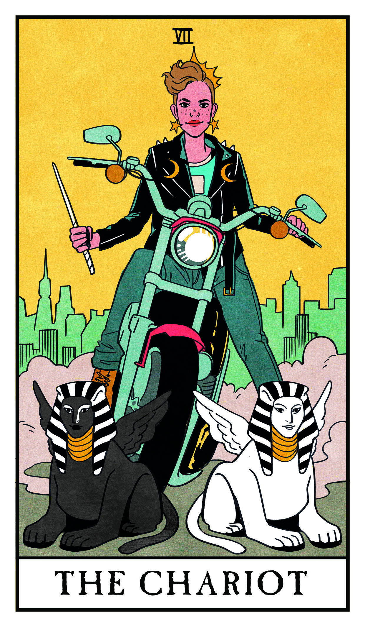
CF You’ve employed unmistakably modern imagery in the cards – for example, The Fool (0) is listening to an iPod-type device, while The Chariot (XII) is riding a motorcycle. Were you ever worried that modernizing the cards might date them, perhaps detracting from their traditionally timeless occult qualities?
LS I think attempting to create ‘timeless’ art is a sort of a fool’s errand. Sure, I’d love my work to persist through the decades, but that’s not really up to me as an artist. I can only try and create what feels true to me right now.
CF As well as updating the imagery of cards, I notice you’ve also updated some of its more traditional symbols around. The pomegranate print we usually see The Empress (III) wearing has transformed into a lemon print in your deck. What was the thinking behind this?
LS That was a nod to a particular musician that inspired that card in a big way.

CF You’ve also flipped other, traditional images; for example, The Lovers (VI) are usually pictured in daylight. In the MWD, we find them in a night garden. Were the changes you’ve made ever purely aesthetic, or was there a clear reasoning behind all of these updates?
LS Sometimes they were aesthetic, sometimes not, With The Lovers in particular, I think the night time setting adds a nice romantic element to their union.
CF Do you yourself appear anywhere in the deck? You’ve said the Ten of Swords was the first card you drew, but I wonder if we might also see you in a card like the Eight of Pentacles, hard at work at the drawing board?
LS Haha, yes! The Eight of Pentacles is indeed a self-portrait. I wasn’t originally planning on it, but when I got to that card, the meaning just felt too perfect for a bit of a self-insert.
CF Which card are you most proud of reinterpreting? Which card proved the most challenging?
LS It’s so hard to pick a favourite. The Ten of Swords will always stand out to me as the card that started the entire deck, and was actually the easiest for me to reimagine. I also love The Chariot and The Magician. As far as the most challenging, it tended to be the simpler cards that actually proved the hardest to reinterpret. For example, The Star was tough to figure out how to put my own spin on. Ditto the Aces. Mainly, because the imagery in the RWS is already so strong and iconic on it’s own, it was tougher to figure out how much or what to alter.
CF You say that you hope the deck will allow would-be diviners to “find a path to your best self.” Has making it allowed the MWD allowed you to find your own best self?
LS Definitely. Working on this deck was such a joy, and honestly one of the most creatively fulfilling projects I’ve worked on. It really helped me get closer to figuring out my own personal artistic style as well, which is something I’ve struggled with for a long time. I hope that these cards speak to readers, and that the love and care I’ve put into creating them shines through.
The Modern Witch Tarot by Lisa Sterle is published by Liminal 11 in November 2019. Pre-order now, £21.99 standard or £65 for the special limited edition. All images © Lisa Sterle and Liminal 11.